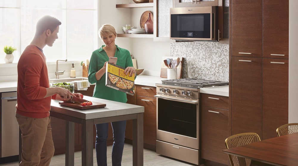
“Our global design is a game changer for Whirlpool Corporation,” said Dan Clements, Whirlpool Corporation’s global director of advanced design. “It’s ‘democratized’ our products by taking a level of design and user experience previously only available at a high price point and making it available to the masses.”
The development story of this global design language is a journey that began five years ago for Whirlpool Corporation’s design team. Their process was an exploration of the industry that led them to rethink everything that was known and accepted about appliances, both by manufacturers and consumers. “Kitchen appliances occupy a precious place in people’s homes and they should deliver on more than just pure function and utility — they should also enhance the home,” said Clements.
This insight was brought to life through the integration of home-inspired finishes, delightful touch points, and a totally re-imagined, connected user experience. “The new global design language is more than just a visual upgrade,” said Clements. “It’s also a unified design system that has unlocked the potential for Whirlpool to offer a larger variety of appliance experiences to consumers across the globe.”
“Kitchen appliances occupy a precious place in people’s homes and they should deliver on more than just pure function and utility — they should also enhance the home,”
The design team’s mission was to shift the focus of home appliances away from the industry’s obsession with technology, and toward a more sensitive approach. They believed there was a strong case to “humanize” appliances globally, both in how they operate and how they integrate into the home environment.
“Overhauling the Whirlpool brand design language was a challenge on three fronts,” explained Clements. The first was to make the user experience more intuitive. “Existing user interfaces were very machine-oriented, archaic, obtrusive, and no smarter about consumers or their preferences after years of ownership,” he said. “Humanizing the experience required sourcing a totally new user interface never before seen on a complete kitchen suite for Whirlpool brand.”
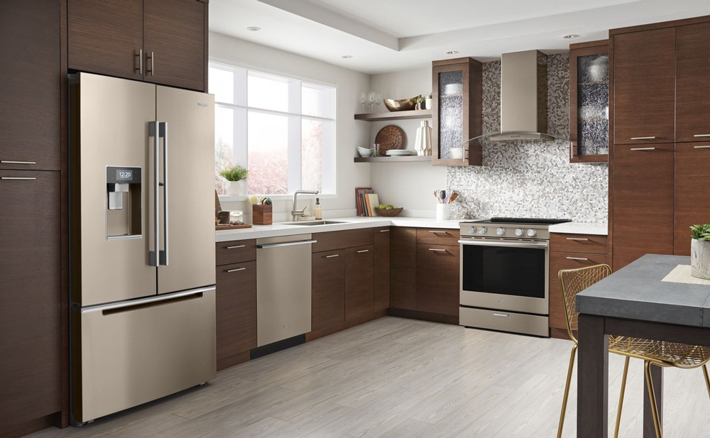
Second, while the Whirlpool brand is sold across five continents, each region had a different level of design maturity. “Consumers’ tastes have become more globally influenced in recent years,” said Clements. “The design team needed to define a progressively modern ‘sweet spot’ that was forward-looking, while remaining suitable for a varied global audience.”
Finally, the existing global product mix was very regional-specific and prevented Whirlpool from offering a more diverse range of products across global regions due to style differences alone. “The belief that we could create one unified design was a working theory we developed as a result of tracking and forecasting trends more than five years ago,” said Christopher Gregory, senior industrial designer for the Global Brand Studio. “This idea was based on a premise that good design would be appreciated anywhere.”
To prove this theory, six Whirlpool Corporation design centers across the globe contributed to the project. The challenge was put to them with a single question: “What is international style?” This question was rooted in the belief that companies like BMW and Apple can successfully sell the same design across the globe, so why can’t Whirlpool?
“This idea was based on a premise that good design would be appreciated anywhere.”
Ethnographic studies were one way of finding that answer, said Whirlpool Corporation’s Senior Manager of the Material, Color and Finish Studio, Jessica McConnell. “Designers and CFM (Color Finish Material) professionals went into homes and apartments across the globe to see how people lived with their appliances. In a lot of cases, we found out that appliances had no harmony with the spaces they were in.” During this process, designers looked at social, cultural, behavioral, fashion, and even automotive trends for inspiration. “Examining where the aesthetic was heading and how behaviors around the food journey were changing pointed us towards a trend of warmer, more welcoming spaces in the home,” said McConnell.
In addition to giving the suite a more harmonious look in today’s homes, thoughtful consideration to IOT and smart technology is part of the suite as well. “As kitchens continue to blend with living areas, appliances flaunting lights, sounds, and screens only add noise to the home,” said Clements. “Whirlpool’s new design language addresses the gap that exists for appliances to make life easier, but also to integrate with people’s homes in a purposeful way.”
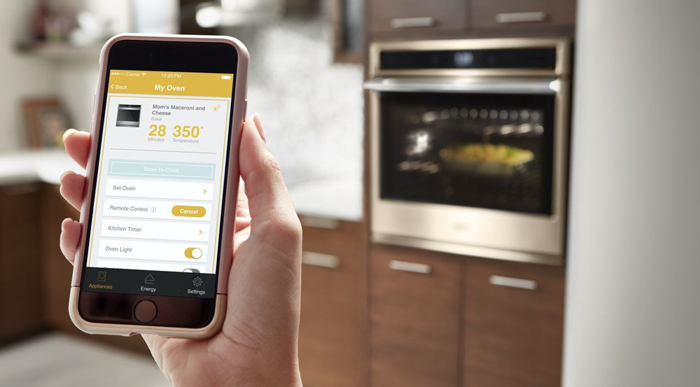
Consumer insights revealed a desire for hands-free control during meal prep
To accomplish this, the new global user experience is centered around a home screen with choices presented as a simple, step-by-step process, so a consumer who learns to use one Whirlpool appliance will know how to use them all — globally. The interface observes which settings are used most often, so over time, the home screen dynamically changes to offer favorite food items for each time of day. Consumer insights revealed a desire for hands-free control during meal prep, so a proximity sensor adjusts the display graphics to improve legibility from a distance, and compatible voice assistants enable changing settings such as oven temperatures.
With a smartphone and Whirlpool’s app, users can scan the barcode from prepared foods, and the proper cooking settings are sent to the oven or microwave instantly. When synced with an Amazon account, the dishwasher estimates when detergent runs low and can automatically order more. The Smart Refrigerator will have forward compatibility with Amazon Virtual Dash to order items like paper towels or coffee on demand. To keep everything current, appliance software updates easily via WiFi.
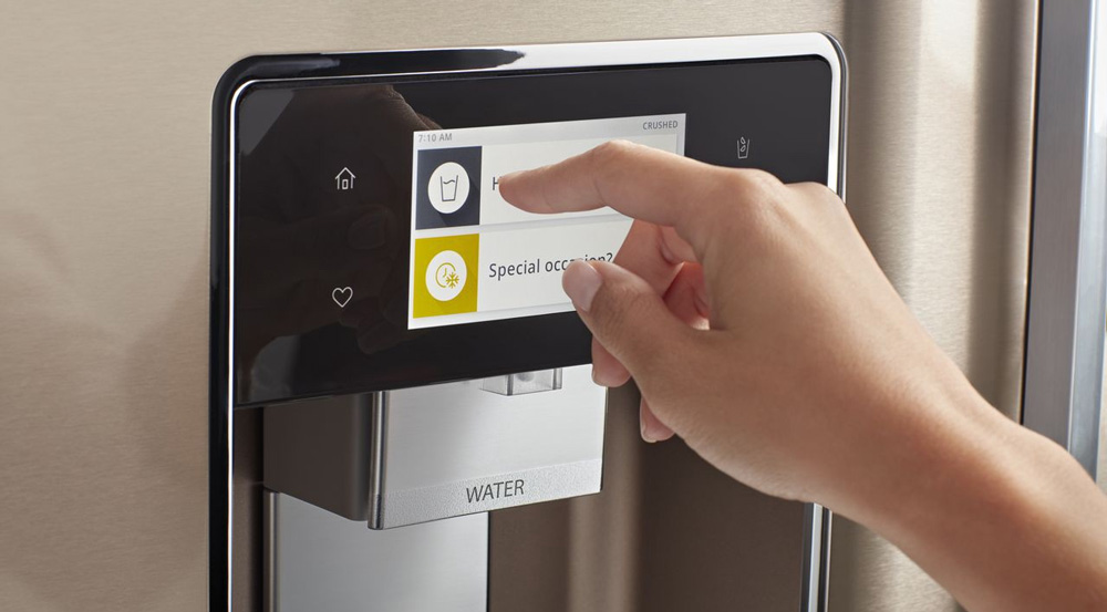
The metallic rose-gold undertones add a subtle warmth to the kitchen and coordinates easily with a wide variety of modern cabinet colors.
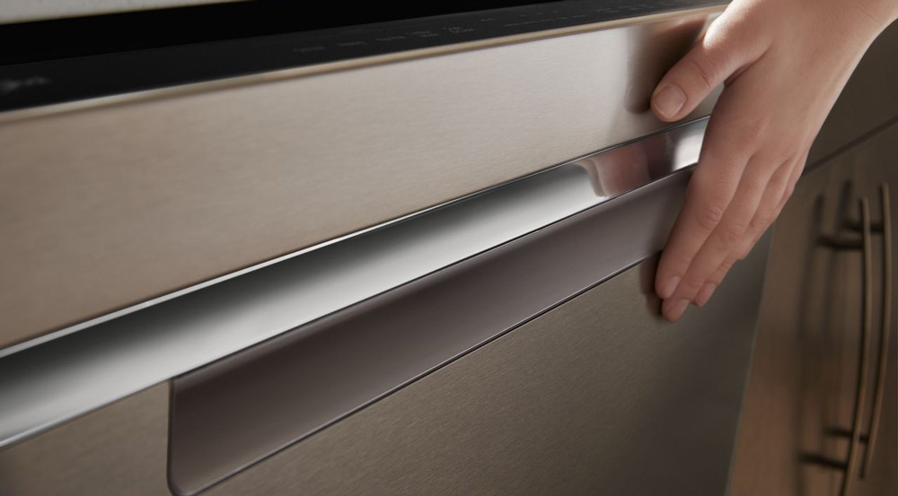
One of the most unique introductions with this suite is Sunset Bronze, a new color finish for consumers who are tired of traditional stainless but still want the benefits associated with it. Sunset Bronze is a fingerprint-resistant coated steel that’s easier to keep clean, with the added benefit of a satin sheen that creates continuity with surrounding surfaces. The metallic rose-gold undertones add a subtle warmth to the kitchen and coordinates easily with a wide variety of modern cabinet colors.
The design team recognized a shift in kitchen design away from ornate details toward more clean-lined cabinet hardware, Shaker style, and full-width cabinet fronts. They used this insight in designing the suite to match this aesthetic. The door-in-door refrigerator, for example, has attached handles and a concealed latch for commonly used cooling compartments, while pocket handles on freezer drawers, microwaves, and dishwashers minimize interference with passers-by. Additionally, barrel knobs on the stove add sophistication similar to contemporary cabinet pulls, but are still intuitive to operate. In sum, this home-inspired approach provides a new framework for considering how appliances can fit into the living space more like furniture and less like machines.
“The bottom line is, if a consumer is going to keep an appliance in their house for 10 years, it has to stay relevant for a long time,” said Clements “That’s why we’re shifting towards making our brands speak to people’s inspirations and aspirations. To put it simply, we want people to fall in love with their appliances.”